
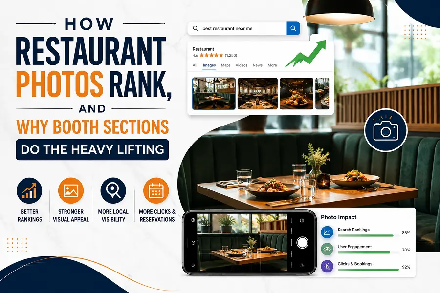
Restaurant search results are increasingly decided before anybody reads a word. The image carousel loads first, the eye lands on one picture rather than another, and the click follows. Which means the photograph is doing ranking work in the practical sense even where it is not a ranking factor in the technical one.
Rooms that photograph well in that context share a physical property that has nothing to do with cameras. Sections built around commercial grade restaurant booths consistently produce the images that survive compression, thumbnail cropping and a two-inch display, and the reason is structural rather than aesthetic.
What a Search Thumbnail Actually Shows
Start with the constraint, because it is more severe than most operators realize.
A restaurant image in a search result is frequently displayed at a few hundred pixels on the long edge, often cropped to a square, and viewed on a phone in daylight. Fine detail is gone. Color is compressed. What survives is large shapes, strong tonal contrast and a clear sense of enclosure or openness.
Photographs of open dining floors do badly under those conditions. A room of freestanding chairs and tables reduces to a field of small similar elements with no dominant shape, and at thumbnail size it becomes texture.
Why a Booth Survives the Crop
A booth is a large, continuous, high-contrast form. It reads at any size.
The back is a vertical plane, usually upholstered, usually darker than the wall behind it. The seat is a horizontal plane. The table sits between them at a fixed relationship. Those three elements create a shape a viewer recognises instantly even when the image is small enough that individual chairs would be unidentifiable.
That recognisability is the whole mechanism. A thumbnail that reads as a restaurant in a quarter of a second gets the click. One that reads as an indistinct interior does not.
The Enclosure Signal
There is a second effect, and it is about what the image communicates rather than what it depicts.
A booth photograph implies privacy, a defined space and a particular kind of visit. Viewers read it as somewhere you sit rather than somewhere you queue. Open-floor photographs are ambiguous by comparison, because the same arrangement of tables and chairs appears in a cafeteria, a hotel breakfast room and a fine-dining room.
Ambiguity is expensive in a carousel. The image that tells a viewer what kind of evening they’re looking at wins against the image that leaves it open.
That is a harder problem than it sounds, because the room genuinely is ambiguous at ten in the morning. The furniture is the only thing in the frame carrying information about the evening.
Where the Structured Data Fits
None of this replaces the technical layer, and the technical layer is where most restaurants are actually losing.
Marking up a restaurant with the vocabulary maintained at schema.org is what allows an image to be associated with the right entity in the first place. Google’s own guidance on structured data is explicit that eligibility for rich presentation depends on the markup being present and accurate.
So the sequence is: markup makes the image eligible, and the furniture decides whether the eligible image gets clicked. Restaurants tend to invest heavily in the first and not at all in the second.
The Photography Advantage Nobody Plans For
Booth sections are also easier to shoot, which matters more than it sounds.
The seating is fixed, so the composition does not need styling. The upholstery gives a large area of controllable color. The back provides a natural backdrop that hides whatever is behind it. And an empty booth does not look abandoned in the way an empty chair does, because the form is complete without an occupant.
A photographer working a morning shoot will get three usable frames from a booth section and thirty discarded attempts from an open floor. The ratio is consistent enough that experienced shooters plan the schedule around it. That difference shows up in the library a restaurant has to draw on for the next five years.
The Accessibility Point That Applies to the Photograph Too
Booth sections carry a compliance obligation, and the way it is resolved affects the images.
Under the 2010 ADA Standards, a proportion of dining surfaces must provide knee and toe clearance and be dispersed rather than clustered. A fixed booth run does not satisfy that by itself, so most rooms mix booths with accessible freestanding positions.
Done deliberately, that mix produces a better photograph as well as a compliant room, because it breaks a long uniform run into sections. Done as an afterthought, it produces an accessible table parked at the end of a booth wall, which is both a worse experience and a worse picture.
What to Change if the Photos Are Underperforming
For an operator whose images are not earning clicks, the practical order:
- Confirm restaurant structured data is present and validating before touching anything physical
- Identify the one section of the room with the strongest continuous shape and shoot it first
- Add tonal contrast between seating and the wall behind it, since compression eats close values
- Shoot at booth height rather than standing, so the form fills the frame
- Test every candidate image at two hundred pixels before choosing
The Part That Compounds
The reason this matters beyond a single shoot is that restaurant images have a long life. They go onto the site, the booking platform, the delivery listings, the map profile and the review pages, and they get replaced rarely.
A room that photographs badly is therefore not making one weak impression. It is making the same weak impression across every surface a potential guest encounters for years, and each of those surfaces is a place where a competitor’s stronger image sits alongside it.
Booth sections are not the only way to fix that, and they are the most reliable, because they solve the problem with architecture rather than with technique. The shape is there whether or not the photographer is good, whether or not the light cooperates, and whether or not anybody remembered to style the table.